Android Button
General Guidelines
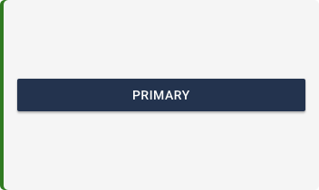
Buttons are used primarily for actions. Some examples include Add, Save, Delete, Cancel etc. Do not use Buttons as navigational elements. Instead, use Links because it takes the user to a new page and is not associated with an action. Each page may have one to two primary buttons. Any remaining calls-to-action are represented as secondary buttons.
Voice and Tone
Buttons should be consolidated to a single word if possible to portray a specific action, like “Submit”. Make the call to action clear by leading with a strong verb that encourages action so the user can anticipate what will happen when they tap. Be consistent among multiple buttons of the same type to avoid any confusion between similar actions and to encourage a confident atmosphere for the user. Buttons should be scannable, so avoid using uncessary words and articles such as the, an, or a.
Usage
| Variant | Where and When |
|---|---|
| Primary | For the primary, or most important call to action on the page |
| Secondary | For secondary action(s) on the page |
| Flat | Used in the navigation bars, dialogs and inline with padding |
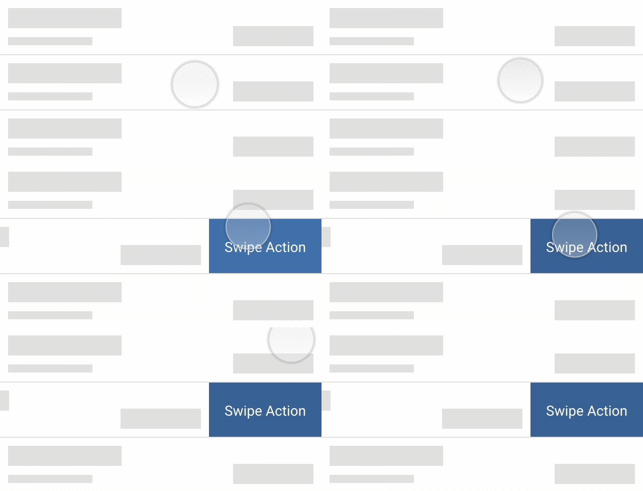
| Swipe Action | Used with interactive rows - revealed after swipe event |
| Fast Action | Used in account details banner area |
Placement
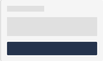
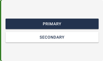
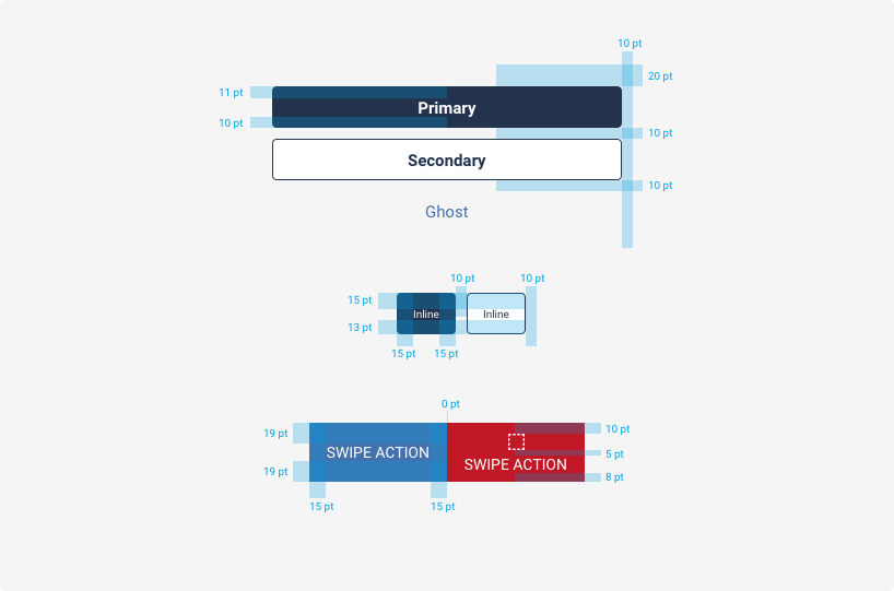
The primary button should be on the top, with the secondary or cancel button on the bottom with 10px margin between the two. Buttons in forms should be sticky to the bottom of the screen (or top of the keyboard if active). If a button is associated with a specific action located in a specific area on the page, then it should be located directly underneath the data/description corresponding to that action.

Variant Guidelines
| State | Where and When |
|---|---|
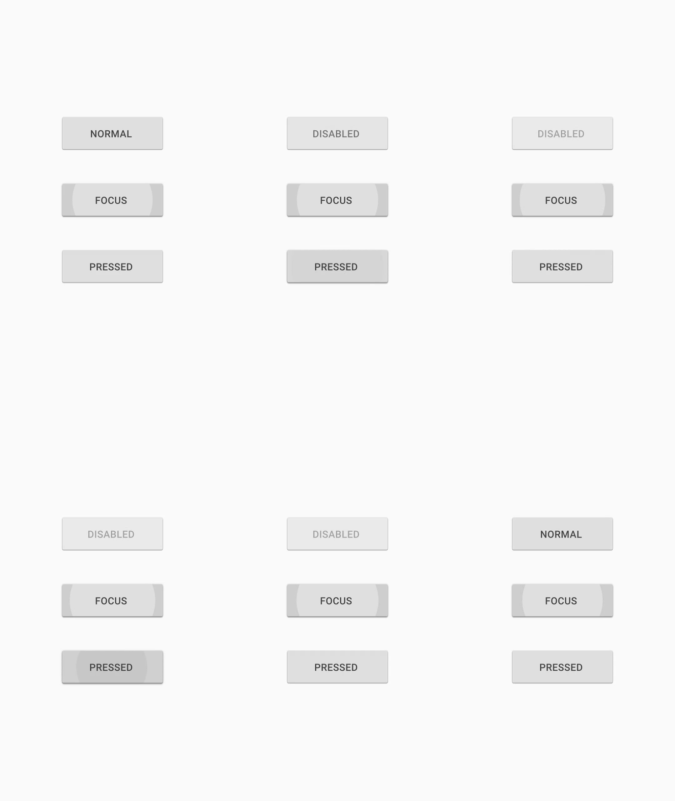
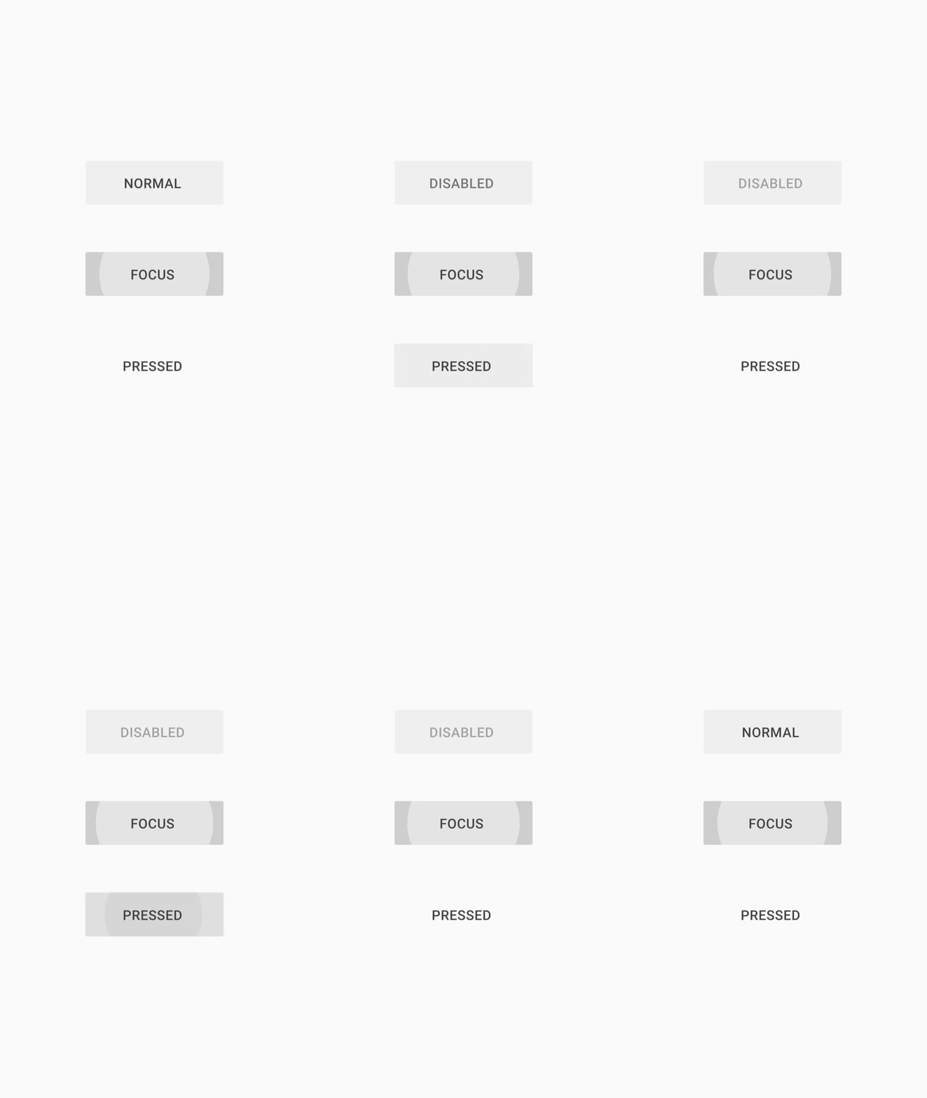
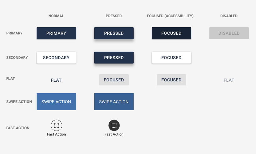
| Normal | The default state of the button when left alone on the screen |
| Pressed | When the user taps the button (before the finger lifts off) |
| Focused | When the user utilizes accessibility gestures to navigate to a button without triggering a tap event |
| Disabled | Used when actions are not available to let the user know some additional action or information must first be collected |
Do’s and Don’ts
Where can I Find This?
You can find buttons in almost every Widget.
Variants
Color and Typography
| Variant | Fill & Border Color | Font |
|---|---|---|
| Primary | @brandPrimaryButtonColor Themeable - Demo color shown #23334E | 15pt Themeable - Demo color shown #FFFFFF |
| Secondary | @brandSecondaryButtonColor #FFFFFF @brandPrimaryButtonColor Themeable - Demo color shown #23334E | 15pt Themeable - Demo color shown #23334E |
| System | @brandTitleFontColor Themeable - Demo color shown #FFFFFF | 13pt Themeable - Demo color shown #FFFFFF |
| Swipe Action | @swipe-action-button-color-destructive Thunderbird @swipe-action-button-color-actionable Steel Blue @swipe-action-button-color-positive Forest Green | 14pt #FFFFFF |
| Fast Action | @light-fast-action-button-color #FFFFFF @dark-fast-action-button-color Mine Shaft | 12pt #FFFFFF 12pt Mine Shaft |
| Inline | @brandPrimaryInlineButtonColor Themeable - Demo color shown #23334E @brandSecondaryInlineButtonColor #FFFFFF @brandSecondaryInlineButtonBorderColor Themeable - Demo color shown #23334E | 14pt #FFFFFF 14pt Themeable - Demo color shown #333333 |
Spacing
Behavior
