Checkbox
General Guidelines
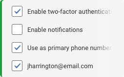
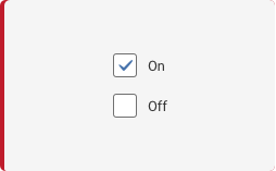
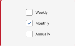
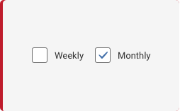
A checkbox is a type of button that lets the user choose between a selection of states, actions, or values. A selected checkbox is considered on when it contains a checkmark and off when it's empty. A checkbox is almost always followed by a title unless it appears in a table. Use check boxes to provide the selection of options that can be combined. For mutually exclusive choices, use a toggle or radio buttons.
Voice and Tone
Be as specific as you can with the least amount of words as you can in your label text to describe what the user is agreeing to, actioning on, or what value they are adding or activating when checking the checkbox.
Grammar and Mechanics
- Concise language
- Sentence case is always used for labels
Placement
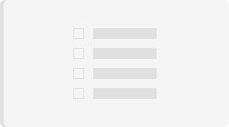
The checkbox label text when used should always appear to the right of the checkbox. When being used in tables they are usually in the left most column within the table to prompt the user to activate the given row.

Label Text
The checkbox label text when used should always appear to the right of the checkbox. The only case when a checkbox will not have label text is when it appears in a table to be tied to individual rows that the user can check on and off.

Do's and Don'ts
How and When do I Use?
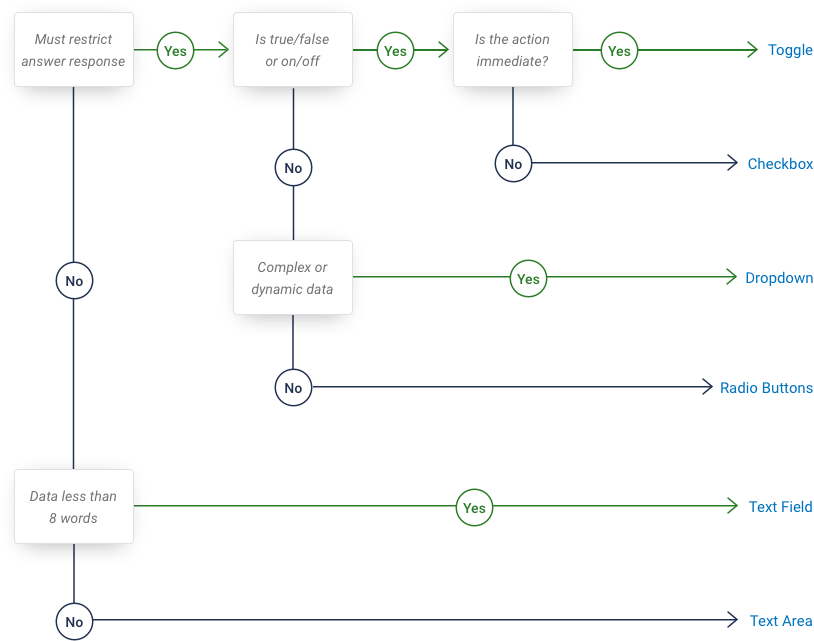
Refer to the diagram below to help you figure out when to use the checkbox component versus another similar component.
Variants

Color and Typography
| Variant | Box Color | Additional Properties/Font |
|---|---|---|
| Static | $checkbox-background-default #FFFFFF $checkbox-border-default #707070 | $checkbox-checkmark-color #4672AB |
| Selected | $checkbox-background-default #FFFFFF $checkbox-border-default #707070 | |
| Focus | $checkbox-background-default #FFFFFF | box-shadow: 0px 0px 4px #4371AD #4371AD |
| Hover | $checkbox-background-default #FFFFFF $checkbox-border-hover #333333 | |
| Disabled | $checkbox-background-default #FFFFFF $checkbox-border-default #707070 | opacity: 50% |
| With Label | $checkbox-background-default #FFFFFF $checkbox-border-default #707070 | 13 pt #333333 Label=sentence case |
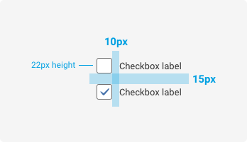
Spacing
Examples
For details on when to use this component, please see the Usage tab.
<div class="iris-checkbox">
    <input class="iris-checkbox__input" name="toppings" type="checkbox" id="checkbox_1" />
    <label class="iris-checkbox__label" for="checkbox_1">
        <span class="iris-checkbox__content">Checkbox</span>
    </label>
</div>
States
<div class="iris-checkbox iris-checkbox--disabled">
    <input class="iris-checkbox__input" name="unique-group" type="checkbox" id="checkbox_3" disabled="disabled" />
    <label class="iris-checkbox__label" for="checkbox_3">
        <span class="iris-checkbox__content">Disabled</span>
    </label>
</div>
Decorators
<div class="iris-checkbox" data-modifier="inverted">
    <input class="iris-checkbox__input" name="unique-group-2" type="checkbox" id="checkbox_inverted" />
    <label class="iris-checkbox__label" for="checkbox_inverted">
        <span class="iris-checkbox__content">Inverted</span>
    </label>
</div>
How about with a lot of text?
Occasionally you will have a label that has a lot of text. If able, the label should be brief and a long description should be added below the checkbox.
<div class="iris-checkbox">
    <input class="iris-checkbox__input" name="long-label" type="checkbox" id="long_label_2" aria-describedby="long_label_2_description"/>
    <label class="iris-checkbox__label" for="long_label_2">
        <span class="iris-checkbox__content">I agree to the terms.</span>
    </label>
    <div class="iris-checkbox__extended-content">
        <span class="iris-checkbox__description" id="long_label_2_description">
             By checking the checkbox, you have read and agree to the terms presented in the <a href="#">Terms and Conditions</a> agreement
        </span>
    </div>
</div>
If having a lot of text is unavoidable, the checkbox label does support this behavior.
<div class="iris-checkbox">
    <input class="iris-checkbox__input" name="long-label" type="checkbox" id="long_label_1" />
    <label class="iris-checkbox__label" for="long_label_1">
        <span class="iris-checkbox__content">While this is not the preferred approach, there are some times you really need to cram a bunch of text inside the label of a checkbox and need to inform the user of something. With that said, the checkbox is built to grow vertically and center its content appropriately for those edge cases.</span>
    </label>
</div>
Checkbox group
If there is a group of related checkboxes, there is some additional markup needed for accessibility purposes. Wrap all of checkbox components in a fieldset with a legend element as the first child that describes the group and the purpose. If it is undesirable to show the legend visually, add a screenreader only class (sr-only) to hide the content for all devices except screen readers.
<fieldset class="example-box">
  <legend class="sr-only">What types of beer do you like?</legend>

  <div class="iris-checkbox">
    <input class="iris-checkbox__input" name="beer-types" type="checkbox" id="beer_1" />
    <label class="iris-checkbox__label" for="beer_1">
        <span class="iris-checkbox__content">Stout</span>
    </label>
  </div>

  <div class="iris-checkbox">
    <input class="iris-checkbox__input" name="beer-types" type="checkbox" id="beer_2" />
    <label class="iris-checkbox__label" for="beer_2">
        <span class="iris-checkbox__content">Lager</span>
    </label>
  </div>

  <div class="iris-checkbox">
    <input class="iris-checkbox__input" name="beer-types" type="checkbox" id="beer_3" />
    <label class="iris-checkbox__label" for="beer_3">
        <span class="iris-checkbox__content">IPA</span>
    </label>
  </div>
</fieldset>
No label available?
The use case for no direct label should be very minimal but we do recognize that it can come up. In those situations the checkbox can be created with no content in the label. In this case you will need to provide an aria-label or an aria-labelledby attribute.
Make sure to add an
aria-labelto let screenreaders know what your checkbox does.
<div class="iris-checkbox">
    <input class="iris-checkbox__input" name="invisible" type="checkbox" id="no_label_1" />
    <label class="iris-checkbox__label" for="no_label_1" aria-label="I still need context"></label>
</div>
Accessibility
As always, we want all of the components in the application to be accessible. Please keep the following notes in mind while using this component:
- Each input MUST have a unique
idand the correspondinglabelmust have aforattribute in order to link the two together. - If the
labeldoesn't have any text, please add thearia-labelattribute to the label element to describe the interaction to a screenreader. - If you are building a group of related checkboxes, use a
fieldsetto wrap the group, add alegendelement as the first child to title the group, and ensure that the checkboxes have the samename.
Troubleshooting
The checkbox is triggering the correct behaviors as though it is acknowledging it is checked. But the blue check mark isn’t actually showing up in the box when checked
The checkbox component is built with pure HTML and CSS, meaning that if the component is not behaving properly it is most likely a markup issue. Keep in mind these factors below to make your checkbox work:
- The ID on the
<input>must match the for attribute of the<label> - In the case of having multiple checkboxes in your view, all your ID’s must be unique.
- The
<input>should come first then the<label>
<div class="iris-checkbox">
    <!--  <input> element should always comes first than the <label> -->
    <input class="iris-checkbox__input" name="toppings" type="checkbox" id="checkbox_1" />
    <!-- the ID "checkbox_1 from the input matches the value on the for attribute below -->
    <label class="iris-checkbox__label" for="checkbox_1">
        <span class="iris-checkbox__content">Checkbox</span>
    </label>
</div>
Variables
The variables used in this component are as follows:
// Border variables
$checkbox-border-default: $dove-gray !default;
$checkbox-border-checked: $dove-gray !default;
$checkbox-border-hover: $mine-shaft !default;
$checkbox-border-focus: $steel-blue !default;

$checkbox-border-width-default: 1px !default;

// Box shadow variables
$checkbox-box-shadow-focus: $steel-blue !default;
$checkbox-box-shadow-disabled: transparent !default;

// Background variables
$checkbox-background-default: $white !default;
$checkbox-background-checked: $white !default;

$checkbox-background-size-default: 73% !default;

// Font variables
$checkbox-checkmark-color: $steel-blue !default;
$checkbox-description: $dove-gray !default;

// Dimension variables
$checkbox-dimension-default: 22px !default;
Themeability
Nothing is themeable in this component.
Variant: *Standard** | State: Static | Decorator: None*
<div class="iris-checkbox ">
    <input class="iris-checkbox__input" name="example" type="checkbox" id="checkbox_Static_None" />
    <label class="iris-checkbox__label" for="checkbox_Static_None">
        <span class="iris-checkbox__content">Standard</span>
    </label>
</div>
Variant: *Standard** | State: Disabled | Decorator: None*
<div class="iris-checkbox iris-checkbox--disabled">
    <input class="iris-checkbox__input" name="example" type="checkbox" id="checkbox_Disabled_None" />
    <label class="iris-checkbox__label" for="checkbox_Disabled_None">
        <span class="iris-checkbox__content">Standard</span>
    </label>
</div>