UI System Font
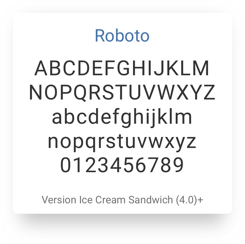
Typography is one of the pillars that any user experience is built upon. One of the philosophies of Iris is to meet users where they are and to provide a comfortable and familiar interaction in our application. In modling that goal, the typography in Iris utilizes system fonts to ensure a seamless engagement based on the device. Below are the fonts that are used by each of the individual platforms:
macOS and iOS

Windows

Android

Usage
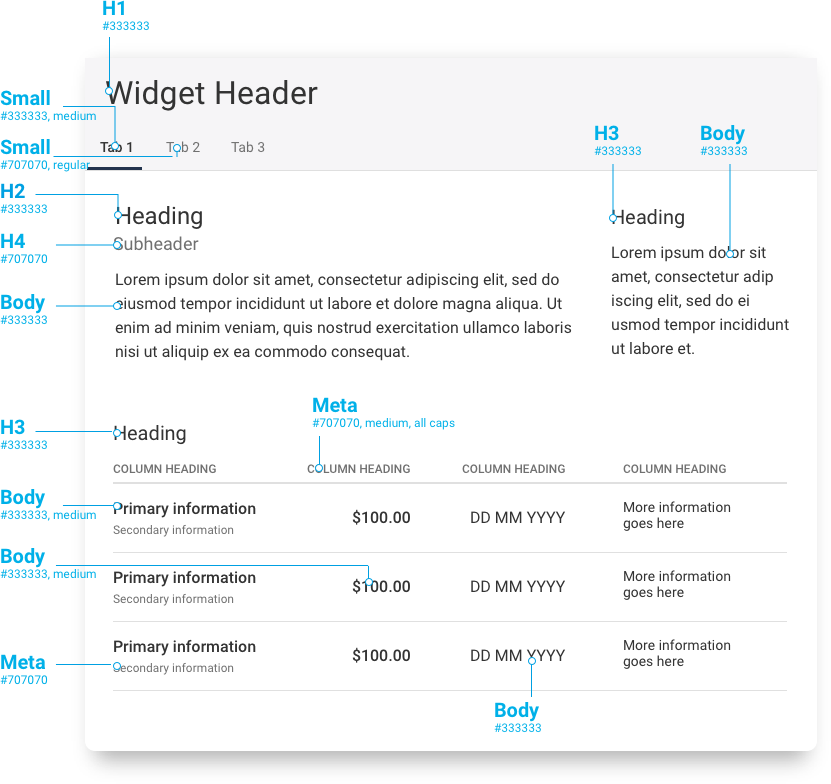
| Name | Size | Line Height | Usage |
|---|---|---|---|
Hero | 44px | 55px | Large web banner image, prominently placed front and center |
H1 | 32px | 40px | Widget Headers |
H2 | 24px | 30px | Secondary Headers, Modal Headers |
H3 | 20px | 25px | Secondary Headers |
H4 | 18px | 22.5px | Secondary Headers |
| Body(base) | 16px | 20px | Body |
| Small | 14px | 17.5px | Button text, secondary info copy, tool tip copy |
For implementation information please see Utility Classes/Font
Examples

Line Length
Recommended line length is 50-75 characters. Keeping your text box to a width of 500 pixels will ensure optimal readibilty.
- Too wide – if a line of text is too long the reader’s eyes will have a hard time focusing on the text.
- Too narrow – if a line is too short the eye will have to travel back too often, breaking the reader’s rhythm.
Baseline
Weights and styles are an important UX element. Bold and italic help readers to see structure and to skim the text more efficiently. Use font weight to call out the most important information.
