Badge
General Guidelines
Badges are labels that display small amounts of information. They show the status of an element, the count of the number of items in a queue (for example: for mail messages), or information about the content.
Badges should not be clickable. (If you need to have an action tied to it, use action buttons instead.)
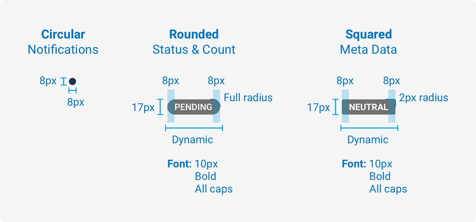
You can use the following three shapes for badges containing information:
- Rounded
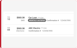
- Squared (always Dove grey or Wild Sand grey)
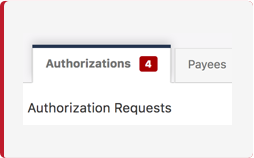
- Circular empty (Notification) Use a themed color.
Voice and Tone
Badges should contain numbers or a single word, in all capital letters, that describes a status (for example: COMPLETED).
- The badges and corresponding colors you can use are:
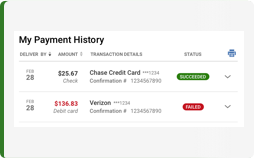
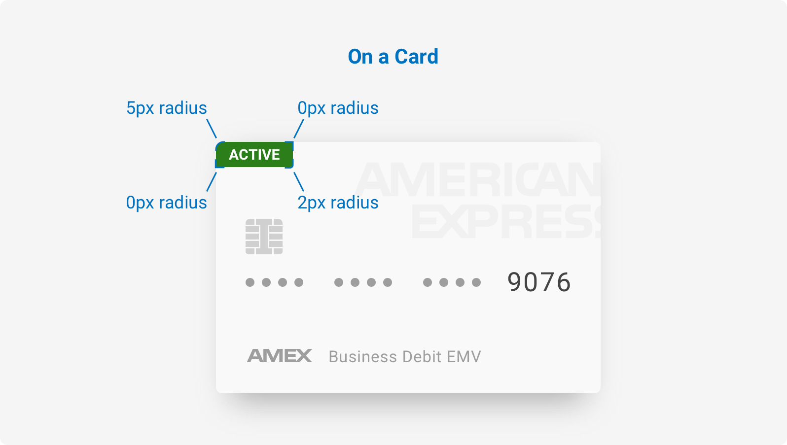
- The Forest Green color denotes a Positive state. Use for Succeeded, Active, Authorized, and Posted.
- The Steel Blue color denotes something a pending state and should be used for Scheduled.
- The Dove Grey color denotes a neutral state. Use for In Progress, Pending, and Prenote.
- The Thunderbird (red) color denotes a negative state. Use for Cancelled and Failed.
- The Orange Roughy color denotes a warning state. Use for Needs Authorization.
- The Wild Sand grey color denotes a content type that is informational to the user. Use Transaction Type (within a record).
Usage
| Configurations | When |
|---|---|
| Rounded | The customer will see the status of the element. The customer will see a numbered count (for example: a number of messages). |
| Squared | The customer will see an informational status (for example: in a record to denote a transaction type). |
| Circular empty (Notification badge) | The customer will not see any information. The badge will display as an empty circle because the design requires an indicator, but no content is necessary (for example: the unread message badge on the profile avatar). |
Do's and Don'ts
Size and Padding
States

Variants
Examples
For details on when to use this component, please see the Usage tab.
Variants
The variants of this component are as follows:
Rounded Badge
<div class="iris-badge iris-badge--rounded iris-badge--positive">
    <span class="iris-badge__content">42</span>
</div>
Square Badge
The squared variant should only be used for meta information. Because of this, it does not have any additional states.
<div class="iris-badge iris-badge--squared">
    <span class="iris-badge__content">Automatic Payment</span>
</div>
Circular Badge
If there is no content inside of the circular badge element, the badge will display as an empty circle, for notification purposes. This can be useful when a design requires an indicator, but no content is necessary (for example: the unread message badge on the profile avatar).
<div class="iris-badge iris-badge--circular iris-badge--info">
    <span class="iris-badge__content">
        <span class="font-icon-fi" role="img" aria-label="Business user"></span>
    </span>
</div>
<div class="iris-avatar pos--relative" data-size="large">
    <div class="iris-avatar__inner">
        <img class="iris-avatar__image" alt="Avatar" src="URL" />
    </div>
    <div class="iris-badge iris-badge--circular iris-badge--info">
        <span class="iris-badge__content">
            <span class="font-icon-fi" role="img" aria-label="Business user"></span>
        </span>
    </div>
</div>
Notification Badge (Empty)
If there is no content inside of the circular badge element, the badge will display as an empty circle. This can be useful when a design requires an indicator, but no content is necessary (e.g. the unread message badge on the profile avatar).

<div class="iris-avatar pos--relative" data-size="large">
    <div class="iris-avatar__inner">
        <img class="iris-avatar__image" alt="Avatar" src="URL" />
    </div>
    <div class="iris-badge iris-badge--circular" data-position="top-right" role="img" aria-label="New message notification"></div>
</div>
States
<div class="iris-badge iris-badge--rounded iris-badge--positive">
    <span class="iris-badge__content">Positive</span>
</div>

<div class="iris-badge iris-badge--rounded iris-badge--negative">
    <span class="iris-badge__content">Negative</span>
</div>

<div class="iris-badge iris-badge--rounded iris-badge--caution">
    <span class="iris-badge__content">Caution</span>
</div>

<div class="iris-badge iris-badge--rounded iris-badge--neutral">
    <span class="iris-badge__content">Neutral</span>
</div>

<div class="iris-badge iris-badge--rounded iris-badge--info">
    <span class="iris-badge__content">Info</span>
</div>

<div class="iris-badge iris-badge--rounded iris-badge--polite">
    <span class="iris-badge__content">Polite</span>
</div>
Decorators
Positioning
All badges can be positioned absolutely, in any of the four corners of an element. To leverage this decorator, the parent to base that you are positioning off of, must have a relative position.
pos--relative to the element to set its position as relative. <div class="pos--relative border--all">
<div class="iris-badge iris-badge--squared" data-position="top-right">
<span class="iris-badge__content">Top Right</span>
</div>
<div class="iris-badge iris-badge--squared" data-position="top-left">
<span class="iris-badge__content">Top Left</span>
</div>
<div class="iris-badge iris-badge--squared" data-position="bottom-right">
<span class="iris-badge__content">Bottom Right</span>
</div>
<div class="iris-badge iris-badge--squared" data-position="bottom-left">
<span class="iris-badge__content">Bottom Left</span>
</div>
</div>Accessibility
As always, we want all of the components in the application to be accessible. Please keep the following notes in mind while using this component:
- When using the
circularvariant for this component with an icon, ALWAYS add anaria-labelattribute to theiris-badgecontainer indicating what the icon is indicating or action you can take by clicking on it. - If a badge is
clickableand not a<button>, add atabindex="0"andaria-role="button"attribute on theiris-badgecontainer to ensure the element is tabbable for keyboard interaction. - If using the "empty" badge variant, always add a
role="img"and a meaningfularia-labelattribute to indicate what the badge indicates.
Variables
The variables used in this component are as follows:
// Background colors
$badge-background-positive: $forest-green;
$badge-background-negative: $thunderbird;
$badge-background-neutral: $dove-gray;
$badge-background-info: $steel-blue;
$badge-background-polite: $alto;

// Border colors
$badge-border-positive: $forest-green;
$badge-border-negative: $thunderbird;
$badge-border-neutral: $dove-gray;
$badge-border-info: $steel-blue;
$badge-border-polite: $alto;

// Font colors
$badge-font-color-light: $white;
$badge-font-color-dark: $mine-shaft;

// Box Shadow
$badge-box-shadow-hover: $mine-shaft;
Themeability
The background color of the circular badge is themeable using the _badge.scss theme overides file. The variables accessible in that file are as follows:
// Background variables
$badge-background: $primary-color !default;

// Text variables
$badge-icon-color: $white !default;
Variant: *Rounded** | State: Positive | Decorator: None*
<div class="iris-badge iris-badge--rounded iris-badge--positive" data-boson="">
        <span class="iris-badge__content">Rounded</span>
</div>
Variant: *Rounded** | State: Negative | Decorator: None*
<div class="iris-badge iris-badge--rounded iris-badge--negative" data-boson="">
        <span class="iris-badge__content">Rounded</span>
</div>
Variant: *Rounded** | State: Neutral | Decorator: None*
<div class="iris-badge iris-badge--rounded iris-badge--neutral" data-boson="">
        <span class="iris-badge__content">Rounded</span>
</div>
Variant: *Rounded** | State: Info | Decorator: None*
<div class="iris-badge iris-badge--rounded iris-badge--info" data-boson="">
        <span class="iris-badge__content">Rounded</span>
</div>
Variant: *Rounded** | State: Polite | Decorator: None*
<div class="iris-badge iris-badge--rounded iris-badge--polite" data-boson="">
        <span class="iris-badge__content">Rounded</span>
</div>
Variant: *Squared** | State: Neutral | Decorator: None*
<div class="iris-badge iris-badge--squared iris-badge--neutral" data-boson="">
        <span class="iris-badge__content">Squared</span>
</div>
Variant: *Circular** | State: Positive | Decorator: None*

<div class="iris-avatar" data-size="large">
    <div class="iris-badge iris-badge--circular iris-badge--positive" data-position="top-right">
        <span class="font-icon-fi" aria-hidden="true"></span>
    </div>
    <div class="iris-avatar__inner">
        <img class="iris-avatar__image" alt="Avatar" src="URL" />
    </div>
</div>
Variant: *Circular** | State: Negative | Decorator: None*

<div class="iris-avatar" data-size="large">
    <div class="iris-badge iris-badge--circular iris-badge--negative" data-position="top-right">
        <span class="font-icon-fi" aria-hidden="true"></span>
    </div>
    <div class="iris-avatar__inner">
        <img class="iris-avatar__image" alt="Avatar" src="URL" />
    </div>
</div>
Variant: *Circular** | State: Neutral | Decorator: None*

<div class="iris-avatar" data-size="large">
    <div class="iris-badge iris-badge--circular iris-badge--neutral" data-position="top-right">
        <span class="font-icon-fi" aria-hidden="true"></span>
    </div>
    <div class="iris-avatar__inner">
        <img class="iris-avatar__image" alt="Avatar" src="URL" />
    </div>
</div>
Variant: *Circular** | State: Info | Decorator: None*

<div class="iris-avatar" data-size="large">
    <div class="iris-badge iris-badge--circular iris-badge--info" data-position="top-right">
        <span class="font-icon-fi" aria-hidden="true"></span>
    </div>
    <div class="iris-avatar__inner">
        <img class="iris-avatar__image" alt="Avatar" src="URL" />
    </div>
</div>
Variant: *Circular** | State: Polite | Decorator: None*

<div class="iris-avatar" data-size="large">
    <div class="iris-badge iris-badge--circular iris-badge--polite" data-position="top-right">
        <span class="font-icon-fi" aria-hidden="true"></span>
    </div>
    <div class="iris-avatar__inner">
        <img class="iris-avatar__image" alt="Avatar" src="URL" />
    </div>
</div>