Toggle
General Guidelines
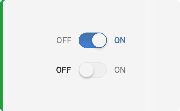
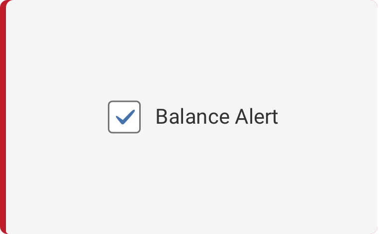
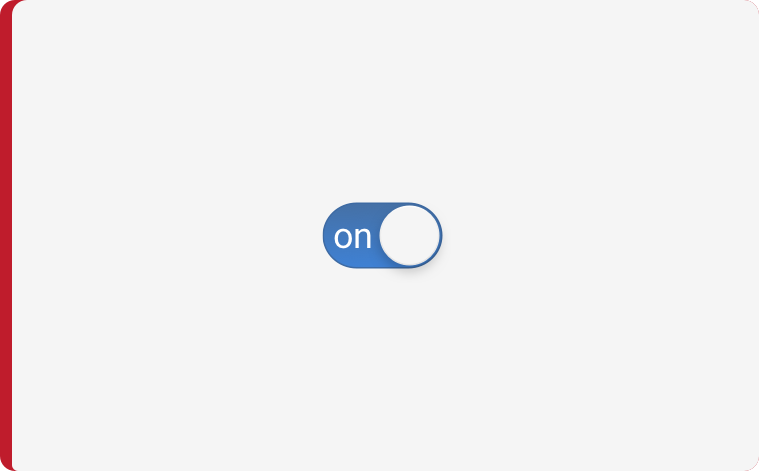
A toggle is used to quickly switch between two possible states. The action occurs immediately when user switches the toggle setting. Toggles support two simple, opposite choices. For other selection components see checkbox or radio buttons.
Voice and Tone
Be as specific as you can with the least amount of words as you can in your label text to describe what the user is agreeing to, actioning on, or what value they are adding or activating when switching the toggle.
Grammer and Mechanics
- Concise language
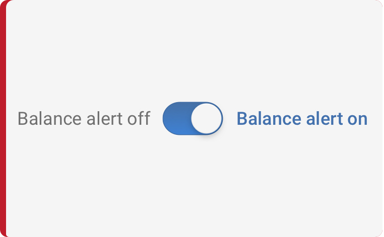
- Sentence case is always used for labels
Label Text
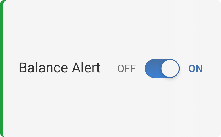
The toggle label text appears when clarification is needed for user to understand the action they are taking. Use adjectives rather than verbs to describe labels and the state of the object affected.

Do’s and Don’ts
How and When to Use
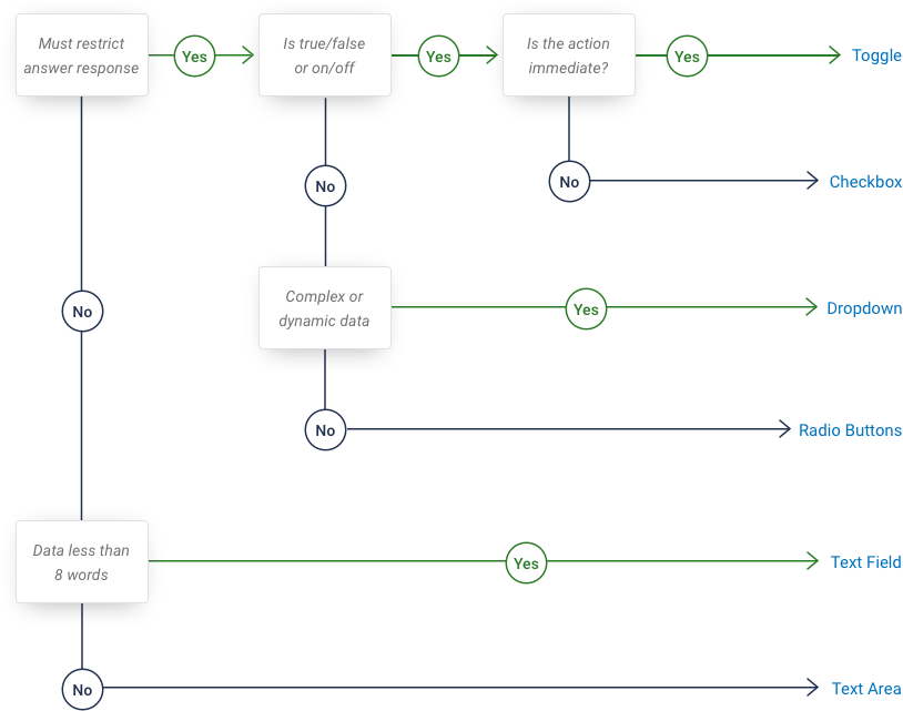
Refer to the diagram below to help you figure out when to use the checkbox component versus another similar component.
States
Color
| Variant | Box Color |
|---|---|
| On Background | $toggle-fill=#4570A5 - #3F81D5 gradiant $toggle-border=#3D6AA3 |
| Off Background | $toggle-fill=#EEEEEE $toggle-border=#E0E0E0 |
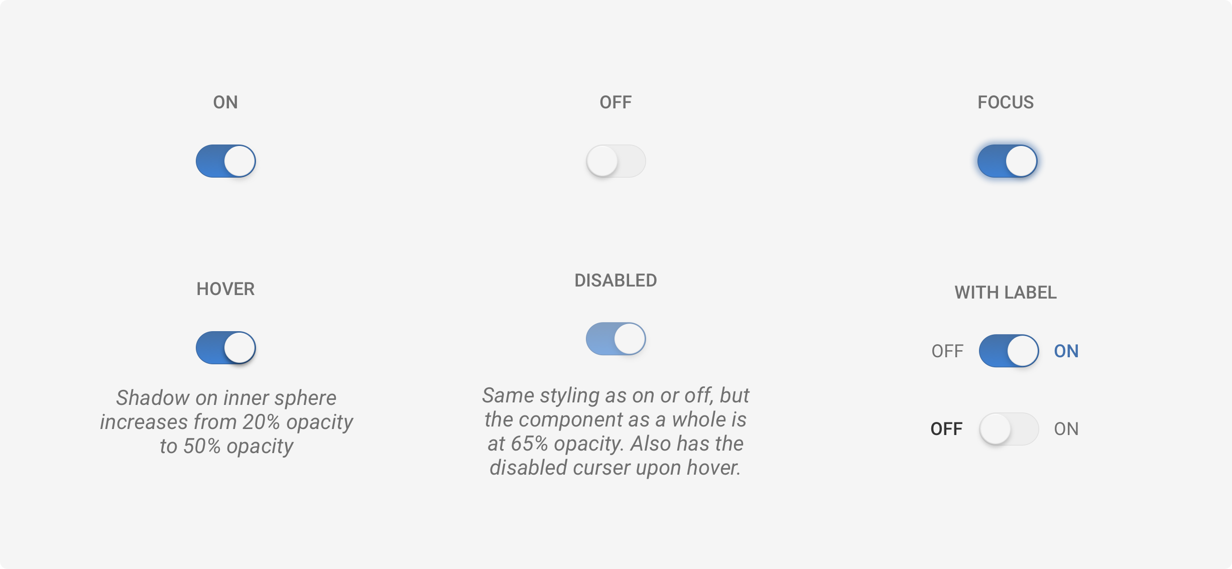
| Circle | $toggle-fill=#F5F5F5 $toggle-border=radial gradient from #FFFFFF - #E3E3E3 box-shadow: 0px 2px 4px #000000 20% opacity |
| Focus | box-shadow: 0px 0px 4px #4371AD |
Spacing and Typography
Examples
For details on when to use this component, please see the Usage tab.
<div class="iris-toggle">
    <input class="iris-toggle__input" type="checkbox" id="unicorns_enabled" />
    <label class="iris-toggle__label" for="unicorns_enabled" aria-label="Enable Unicorns">
        <span class="iris-toggle__left" aria-hidden="true">Off</span>
        <span class="iris-toggle__inner"></span>
        <span class="iris-toggle__right" aria-hidden="true">On</span>
    </label>
</div>
States
<div class="iris-toggle iris-toggle--disabled">
    <input class="iris-toggle__input" type="checkbox" id="disabled_example" disabled/>
    <label class="iris-toggle__label" for="disabled_example" aria-label="Disabled Example">
        <span class="iris-toggle__left" aria-hidden="true">I am</span>
        <span class="iris-toggle__inner"></span>
        <span class="iris-toggle__right" aria-hidden="true">Disabled</span>
    </label>
</div>
Accessibility
As always we want to keep all of the components in the application accessible. Please keep these notes in mind while using this component:
- Each input MUST have a unique
idand the correspondinglabelmust have aforattribute in order to link the two together. - The
aria-labelattribute should be added to thelabelelement to describe the intention to a screenreader. - Always add the
aria-hiddenattribute on the left and right labels to ensure the screenreader only reads thearia-labeland not additional text.
Variables
The variables used in this component are as follows:
// Text variables
$toggle-label-default: $mine-shaft !default;
$toggle-label-active: $steel-blue !default;
$toggle-label-inactive: $dove-gray !default;

// Border variables
$toggle-inner-border-default: $alto !default;
$toggle-inner-border-active: $san-marino !default;
$toggle-inner-border-width: 0.5px !default;

// Box shadow variables
$toggle-box-shadow-default: 0 2px 3px 0 rgba(0, 0, 0, 0.5) !default;
$toggle-box-shadow-focus: 0 0 4px 2px $steel-blue !default;
$toggle-box-shadow-disabled: 0 0 4px 2px transparent !default;

// Background variables
$toggle-inner-background-default: $alto !default;
$toggle-inner-background-active: $steel-blue;
$toggle-inner-before-background-active: linear-gradient(to bottom, $steel-blue, $havelock-blue) !default;
$toggle-mechanism-background-default: $white !default;
$toggle-mechanism-background-active: $white !default;

// Padding variables
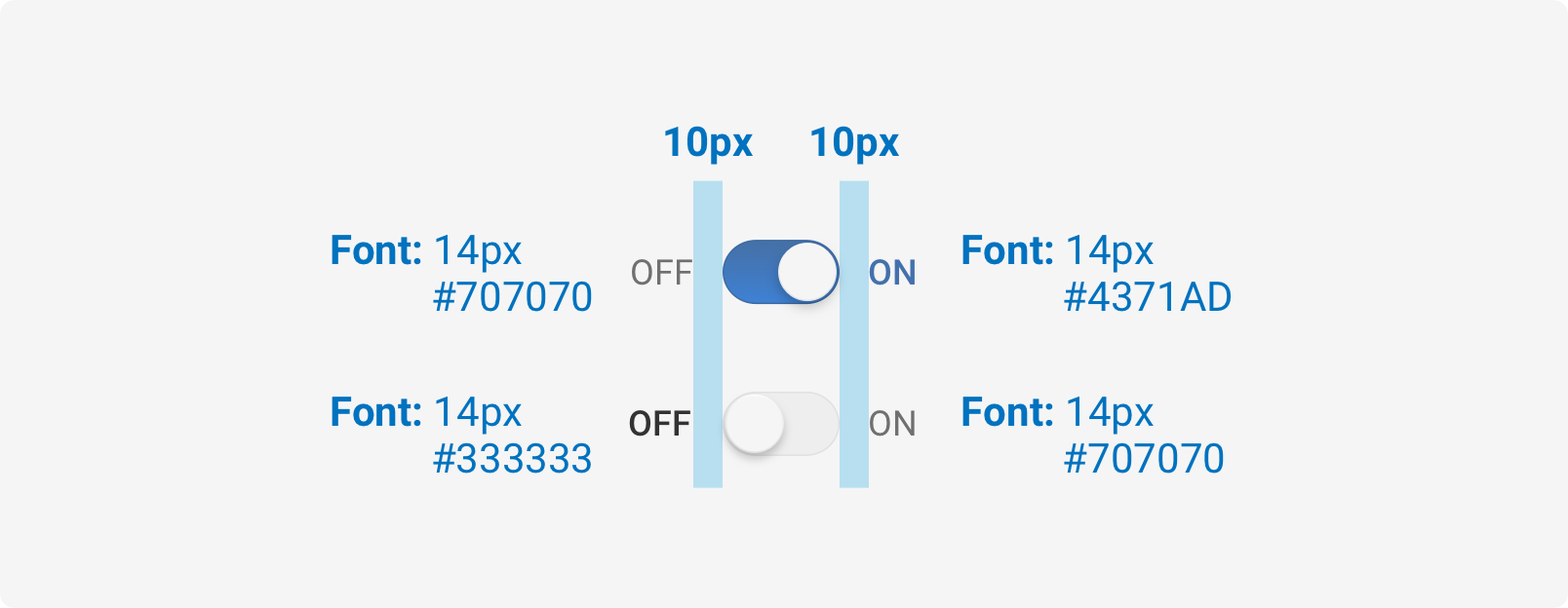
// This ensures the height matches the design. (11 x 2) x (20 x 2) = 22px x 40px
$toggle-inner-padding-default: 1.1rem 2rem !default;

// Font variables
$toggle-font-weight-inactive: $font-weight-standard !default;
$toggle-font-weight-active: $font-weight-standard !default;

// Offset variables
$toggle-mechanism-pixel-offset-off: 1px !default;
$toggle-mechanism-pixel-offset-on: 2px !default;
Themeability
Nothing is themeable in this component.
Variant: *Standard** | State: Static | Decorator: None*
<div class="iris-toggle ">
    <input class="iris-toggle__input" type="checkbox" id="email_enabled" />
    <label class="iris-toggle__label" for="email_enabled" aria-label="Enable Email Alerts">
        <span class="iris-toggle__left" aria-hidden="true">Off</span>
        <span class="iris-toggle__inner"></span>
        <span class="iris-toggle__right" aria-hidden="true">On</span>
    </label>
</div>
Variant: *Standard** | State: Disabled | Decorator: None*
<div class="iris-toggle iris-toggle--disabled">
    <input class="iris-toggle__input" type="checkbox" id="email_enabled" />
    <label class="iris-toggle__label" for="email_enabled" aria-label="Enable Email Alerts">
        <span class="iris-toggle__left" aria-hidden="true">Off</span>
        <span class="iris-toggle__inner"></span>
        <span class="iris-toggle__right" aria-hidden="true">On</span>
    </label>
</div>