Popover
General Guidelines
Popovers are used for situations where you want the user to make a pertinent choice that cannot be made at a later time. Often the choice involves risk that may not be obvious to the user. Examples include:
- When the user is about to permanently alter
- When the user is about to delete Popovers are always actionable vs tooltips that are informational only. They appear when the user clicks and remain open until the user takes action or closes out. Use popover sparingly as they are interruptive to the user. Always allow users to click outside of popover to exit.
Voice and Tone
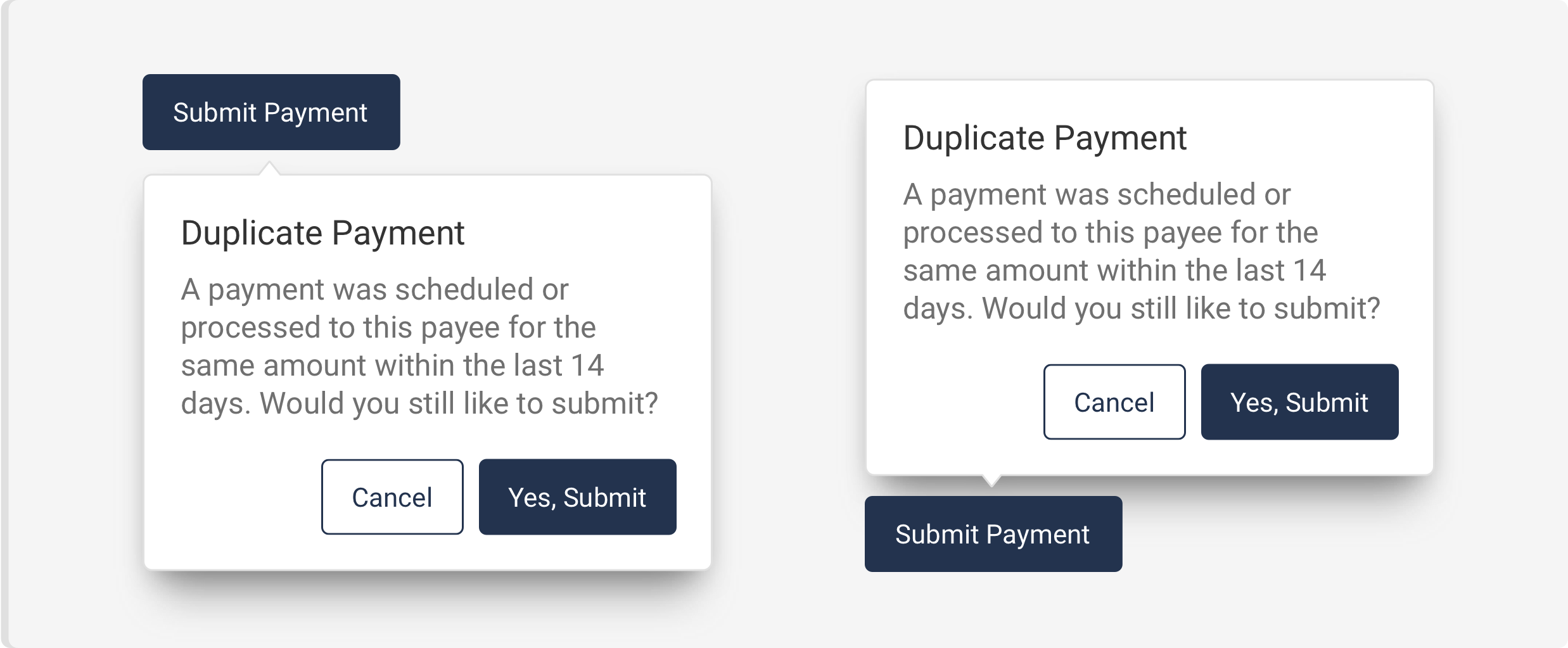
Title should be clear and concise and often asks a question. The content is short and clearly describes any risk in the action being taken by user. The buttons should have a cancel option and an affirmative action.

Placement
The popover automatically appears on the side with the most screen real estate. You may decide you would like the popover to have a default of opening on a certain side.
Do’s and Don’ts


Spacing, size, padding, and typography

Examples
For details on when to use this component, please see the Usage tab. Just need a simple tooltip? Check out the Tooltip Component instead of using a Popover.
Basic Example
Appending the attribute data-popover to an element will notify that element that there should be a popover nearby in which to attach to.
<button class="iris-button iris-button--primary" type="button" data-popover>
    <span class="iris-button__text">Show Popover</span>
</button>
<div class="iris-popover">
    <div class="iris-popover__content">
        <span>Hi! I'm a Popover.</span>
    </div>
</div>
Popover Position
By specifying the attribute data-placement with values default, left, right, top, or bottom you can tell the popover to prefer attaching to one of these sides of the element.
<!-- Position to the Left -->
<button class="iris-button iris-button--primary" type="button" data-popover data-placement="left">Show Left Popover</button>
<div class="iris-popover">
    <div class="iris-popover__content">
        <span>To the left! To the left!</span>
    </div>
</div>

<!-- Position to the Right -->
<button class="iris-button iris-button--primary" type="button" data-popover data-placement="right"><span class="iris-button__text">Show Right Popover</span></button>
<div class="iris-popover">
    <div class="iris-popover__content">
        <span>To the right! To the right!</span>
    </div>
</div>

<!-- Position Above -->
<button class="iris-button iris-button--primary" type="button" data-popover data-placement="top">Show Top Popover</button>
<div class="iris-popover">
    <div class="iris-popover__content">
        <span>To the top!</span>
    </div>
</div>

<!-- Position Below -->
<button class="iris-button iris-button--primary" type="button" data-popover data-placement="bottom">Show Bottom Popover</button>
<div class="iris-popover">
    <div class="iris-popover__content">
        <span>To the bottom!</span>
    </div>
</div>
Popover Indicator
By specifying the attribute data-indicator with values auto, start, center, end, or none, you can control the position of the caret that attaches to the element.
<!-- Indicator Start -->
<button class="iris-button iris-button--primary" type="button" data-popover data-placement="top" data-indicator="start">Show Popover</button>
<div class="iris-popover">
    <div class="iris-popover__content">
        <span>Indicator is at the start.</span>
    </div>
</div>

<!-- Indicator Center -->
<button class="iris-button iris-button--primary" type="button" data-popover data-placement="top" data-indicator="center">Show Popover</button>
<div class="iris-popover">
    <div class="iris-popover__content">
        <span>Indicator is in the center.</span>
    </div>
</div>

<!-- Indicator End -->
<button class="iris-button iris-button--primary" type="button" data-popover data-placement="top" data-indicator="end">Show Popover</button>
<div class="iris-popover">
    <div class="iris-popover__content">
        <span>Indicator is at the end.</span>
    </div>
</div>

<!-- Indicator None -->
<button class="iris-button iris-button--primary" type="button" data-popover data-placement="top" data-indicator="none">Show Popover</button>
<div class="iris-popover">
    <div class="iris-popover__content">
        <span>Indicator? What indicator?</span>
    </div>
</div>
Popover Sizes
Giving the popover component the attribute data-size will give the popover a specific width. You can specify small, medium, or large.
<!-- Small Popover -->
<button class="iris-button iris-button--primary" type="button" data-popover data-placement="top" data-indicator="none">Show Popover</button>
<div class="iris-popover" data-size="small">
    <div class="iris-popover__content">
        <span>This is a small popover</span>
    </div>
</div>

<!-- Medium Popover -->
<button class="iris-button iris-button--primary" type="button" data-popover data-placement="top" data-indicator="none">Show Popover</button>
<div class="iris-popover" data-size="medium">
    <div class="iris-popover__content">
        <span>This is a medium popover</span>
    </div>
</div>

<!-- Large Popover -->
<button class="iris-button iris-button--primary" type="button" data-popover data-placement="top" data-indicator="none">Show Popover</button>
<div class="iris-popover" data-size="large">
    <div class="iris-popover__content">
        <span>This is a large popover</span>
    </div>
</div>
Rich Media Popover
In some Popovers, you might want to have some actions available or a header. Popover supports this use case as well. You will want to specify one of the sizes when you want more robust content.
Coffee required
<button class="iris-button iris-button--primary" type="button" data-popover data-placement="top"><span class="iris-button__text">Popover for some coffee!</span></button>
<div class="iris-popover" data-size="small">
    <div class="iris-popover__header">
        <h4 class="iris-popover__title">Coffee required</h4>
    </div>

    <div class="iris-popover__content">
        Sweet eu, macchiato, to go coffee single origin doppio affogato.
    </div>

    <div class="iris-popover__footer flex-justify--center">
        <button class="iris-button iris-button--ghost">
            <span class="font-icon-retry iris-button__icon"></span>
            <span class="iris-button__text">Retry</span>
        </button>
    </div>
</div>
Close Popover when no longer in focus
A property data-close-on-leave can be added to a Popover in order to make the Popover close when either a click or focus leaves the Popover.
<button class="iris-button iris-button--primary" type="button" data-popover>
    <span class="iris-button__text">Show Popover</span>
</button>
<div class="iris-popover" data-close-on-leave>
    <div class="iris-popover__content">
        <span>Close me by clicking anywhere outside of me!</span>
    </div>
</div>
Accessibility
As always we want to keep all of the components in the application accessible. Things to consider:
data-popoverworks best on a button or link. Other elements my require a role attribute to be set.data-closeshould be placed on a button is you add a close action.
Accessibility that Popover provides for you:
- wires up keyboard events if a button or link isn't used.
- wires up
aria-expandedto thedata-popoverelement. - wires up
aria-controlsto thedata-popoverelement if it isn't specified. - wires up
tab-indexfor both thedata-popoverand the target element.
API
Examples
Getting the PopoverComponent Object of an Element
var popoverElement = document.getElementById('test_iris_popover');
var popoverComponentInstance = Alkami.Iris.PopoverComponent.componentForElement(element);

// Toggles the collapsed state
popoverComponentInstance.toggle();
Getting the notification for opening / closing events
var element = document.getElementById('test_iris_popover');

element.addEventListener('expandstart', function(event) {
    console.log('The popover has started expanding.');

    // The event detail object contains additional information about the popover
    const popoverSourceElement = event.detail.sourceElement;
    const popoverTargetElement = event.detail.targetElement;
    const popoverExpandedState = event.detail.expanded;
    const popoverCollapsedState = event.detail.collapsed;
    const popoverComponentInstance = event.detail.component;
});

element.addEventListener('expandend', function(event) {
    console.log('The popover has finished closing.');

    // To check if the popover is opening or closing, query the expanded property.
    const isPopoverOpen = event.detail.expanded;
});
Events
Events fire on the source Element. Unlike some of the other Iris components, popovers only have two events (starting and ending) which are used for both fading in as well as fading out. The lifecycle looks like this:
// Action happens to trigger the popover to open
// DISPATCH => expandstart
// DISPATCH => expandend

// Action happens to trigger the popover to close
// DISPATCH => expandstart
// DISPATCH => expandend| Name | Description |
|---|---|
| expandstart | Fires when the expanded property is changed and the transition (either in or out) begins. |
| expandend | Fires when the expanded property is changed and the transition (either in or out) completes. |
Constructors
new PopoverComponent(element, options?)
element- The element with adata-popoverattribute.options- Options passed to the Popover.
Creates a new Popover Component.
Methods
static PopoverComponent.init(node?)
Initializes any new Popover Components found if node is not passed in, otherwise initializes only on the node. Returns an array of PopoverComponent.
static PopoverComponent.destroy(node)
Destroys the PopoverComponent viewmodel associated with the node.
static PopoverComponent.refresh(nodes)
Initializes any new popover components on the node(s) passed in. Returns an array of PopoverComponent.
static PopoverComponent.componentForElement(sourceElement)
sourceElement- The element that may be a PopoverComponent.
Checks if a DOM element has a PopoverComponent object associated with it. Returns the PopoverComponent object if one exists or null if one is not found.
popoverComponentInstance.toggle()
An alias method for quickly toggling the expanded property for a specific popover viewmodel, to hide or show the associated popover element.
Properties
popoverComponentInstance.placement*
- string
Gets the placement value for the popover as indicated in the data-placement attribute. Default value is auto. read-only
popoverComponentInstance.indicator
- string
Gets the indicator position value for the popover as indicated in the data-indicator attribute. Default value is center. read-only
popoverComponentInstance.sourceElement
- HTMLElement
Gets the base element that is set up to trigger the popover. read-only
popoverComponentInstance.targetElement
- HTMLElement
Sets/Gets the popover html element that is set up to appear when the sourceElement is triggered.
popoverComponentInstance.expanded
- boolean
Sets/Gets the open state of the popover manually.
popoverComponentInstance.collapsed
- boolean
Sets/Gets alias to update the expanded property.
popoverComponentInstance.focusable
- boolean
Sets/Gets the focusable property that is driven by the data-focus attribute on the source element.
Variables
// Color variables
$popover-background-color: $white !default;
$popover-text-color-default: $dove-gray !default;
$popover-border-color: $alto !default;

// Text variables
$popover-font-size: 1.4rem !default;

// Width variables
$popover-width-small: $container-width-small !default;
$popover-width-medium: $container-width-medium !default;
$popover-width-large: $container-width-large !default;
Themeability
Nothing is themeable in this component.