Switchboard
General Guidelines
Switchboards are used when there is a need to offer the customer the ability to switch between different types of content or between views, for example, a list view, a pie chart, and a bar chart.
As a best practice, switchboards should not exceed three options to be mindful of screen size limitations. When there are more than three options, consider using other selectors, like dropdowns.
Placement
A switchboard component, in most cases, appears above and to the right of the area of content.
Voice and Tone
Switchboard options should be limited to a couple words that convey the options that are available.
Grammar and Mechanics
- Switchboards use title case
- Switchboards should be similar in length and format, in relationship to each other
- Switchboards should not be used in lieu of radio button groups or toggles
Usage
| Configurations | When |
|---|---|
| Use a switchboard | When the user needs to be able to switch between different views of content. |
| Use a switchboard | When you have two or three options only. |
Do's and Don'ts


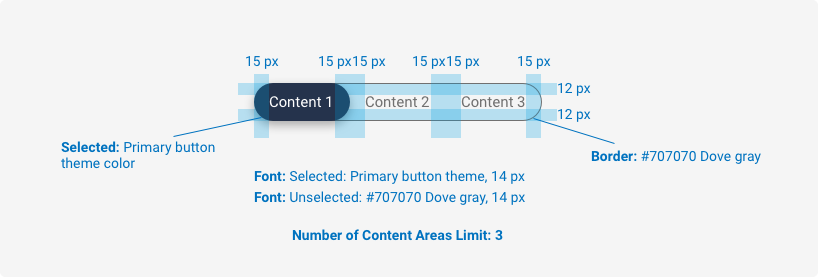
Spacing, size, padding, and typography

Examples
For details on when to use this component, please see the Usage tab.
<div role="group" class="iris-switchboard">
    <input id="list_view" class="iris-switchboard__input" type="radio" name="test" checked/>
    <label for ="list_view" class="iris-switchboard__label">
        <i class="font-icon-list" aria-hidden="true"></i>
        List View
    </label>
    <input id="pie_chart" class="iris-switchboard__input" type="radio" name="test" />
    <label for="pie_chart" class="iris-switchboard__label">
        <i class="font-icon-budgets" aria-hidden="true"></i>
        Pie Chart
    </label>
    <input id="bar_chart" class="iris-switchboard__input" type="radio" name="test" />
    <label for="bar_chart" class="iris-switchboard__label">
        <i class="font-icon-investments" aria-hidden="true"></i>
        Bar Chart
    </label>
</div>
Accessibility
As always, we want all of the components in the application to be accessible. Please keep the following notes in mind while using this component:
- Each
inputMUST have a uniqueidand the correspondinglabelmust have aforattribute in order to link the two together. - Always add the
aria-hiddenattribute to icons
Variables
The variables used in this component are as follows:
// Border variables
$switchboard-border: 1px solid $alto !default;
$switchboard-border-radius: 3.5rem !default;

// Text variables
$switchboard-font-size: 1.4rem !default;
$switchboard-label-text-color: $dove-gray !default;

// Box shadow variables
$switchboard-label-box-shadow-active: 0 5px 20px -5px rgba(0, 0, 0, 0.3) !default;
$switchboard-box-shadow-focus: 0 0 4px 2px $steel-blue !default;
Themeability
With Switchboards, the active background, and text color are themeable. The variables available in the _switchboard.scss theme overide file are as follows:
// Background variables
$switchboard-label-background-active: $primary-color !default;

// Text variables
$switchboard-label-text-color-active: $wild-sand !default;