Content Header
General Guidelines
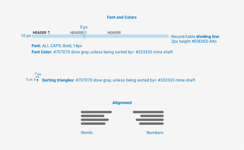
Content headers are used at the top of a section and placed above the content they refer to. They delineate or label data or a section of content (for example a column header in a table).
Voice and Tone
Content Headers should be clear, concise, and descriptive of the content they relate to. Content Headers should generally not exceed three words in order to facilitate scannability and maintain the clarity of the design.
Grammar and Mechanics
- Column headers should be presented in ALL CAPS.
- Section headers should be title case.
- Content headers should be limited to two or three words.
Usage
| Configurations | When |
|---|---|
| Use a section header | When content is not formatted in columns. |
| Use static content headers | When content is formatted in columns that do not need to be sorted. |
| Use sortable content headers | When content is formatted in columns that can be sorted. |
Do's and Don'ts


spacing, size, padding, and typography

Examples
For details on when to use this component, please see the Usage tab.
Variants
The variants of this component are as follows:
Static Header
<div class="iris-content-header">
    <div class="container-fluid">
        <div class="row">
            <div class="col-3">
                <div class="iris-content-header__item">Date</div>
            </div>
            <div class="col-3">
                <div class="iris-content-header__item">Description</div>
            </div>
            <div class="col-3">
                <div class="iris-content-header__item">Account</div>
            </div>
            <div class="col-3">
                <div class="iris-content-header__item">Amount</div>
            </div>
        </div>
    </div>
</div>
Decorators
Sortable
When the column can be sorted by a specifc header, adding data-sortable will add the sorting arrows to the right of the item.
<div class="iris-content-header">
    <div class="container-fluid">
        <div class="row">
            <div class="col-3">
                <button class="iris-content-header__item" data-sortable>
                    Unsorted
                    <div class="iris-content-header__sorter"></div>
                </button>
            </div>
            <div class="col-3">
                <button class="iris-content-header__item iris-content-header__item--descending" data-sortable>
                    Descending
                    <div class="iris-content-header__sorter"></div>
                </button>
            </div>
            <div class="col-3">
                <button class="iris-content-header__item iris-content-header__item--ascending" data-sortable>
                    Ascending
                    <div class="iris-content-header__sorter"></div>
                </button>
            </div>
            <div class="col-3">
                <div class="iris-content-header__item">Static</div>
            </div>
        </div>
    </div>
</div>
Section Header
Sometimes a simple header is needed to proceed content. Use the content header with an h-tag to get a static header for a group of content.
Section Header
<div class="iris-content-header">
    <h4 class="iris-content-header__title">Section Header</h4>
</div>
Accessibility
As always, we want all of the components in the application to be accessible. Please keep the following notes in mind while using this component:
- Always use a
<button>element for a header item that is sortable to attach the roles and interactions for a screenreader.
Accessibility that ContentHeader provides for you:
- Handles creating an
aria-describedbyelement to describe the sorting interaction. - Adds the
aria-labelattribute and updates based on sorted state. - Automatically changes the
describedbytext to indicate what the sort action is.
API
Examples
Getting the ContentHeaderComponent Object of an Element
var element = document.getElementById('iris_content_header');
var ContentHeaderComponent = Alkami.Iris.ContentHeaderComponent.componentForElement(element);
Event listener to parent content header or any of their children
const contentHeaderElement = document.getElementById('content_header');
const contentHeaderChildElement = document.getElementById('content_header_child');

// Add an event listener to any of the children
contentHeaderChildElement.addEventListener('iris.sort.after', (event) => {
    event.detail.component; // => Content header instance
    event.detail.childComponent; // => Content header active child instance
});

// Or add an event to the parent content header element itself
contentHeaderElement.addEventListener('iris.contentHeader.sort.after', (event) => {
    event.detail.component; // => Content header instance
    event.detail.childComponent; // => Content header active child instance
});
Events
A sorted event will fire when a iris-content-header__item element is clicked.
| Name | Description |
|---|---|
| iris.sort.before | Fired before any modifications have been performed (fired on the child element). |
| iris.sort.after | Filed when all operations have been completed from the user action (fired on the child element). |
| iris.contentHeader.sort.before | Fired before any modifications have been performed (fired on the parent element). |
| iris.contentHeader.sort.after | Filed when all operations have been completed from the user action (fired on the parent element). |
Constructors
new ContentHeaderComponent(element)
element- Theiris-content-headerElement.options- Options passed to the Content header.
Creates a new content header component.
Methods
static ContentHeaderComponent.init(node?)
Initializes any new content header Components found if node is not passed in, otherwise initializes only on the node. Returns an array of ContentHeaderComponent.
static ContentHeaderComponent.destroy(node)
Destroys the ContentHeaderComponent viewmodel associated with the node.
static ContentHeaderComponent.refresh(nodes)
Initializes any new content header components on the node(s) passed in.. Returns an array of ContentHeaderComponent.
static ContentHeaderComponent.componentForElement(sourceElement)
sourceElement- The element that may be a ContentHeaderComponent.
Checks if a DOM element has a ContentHeaderComponent object associated with it. Returns the ContentHeaderComponent object if one exists or null if one is not found.
Properties
contentHeader.activeChildComponent
- ContentHeaderItem Get the 'activeChildComponent' of the content header.
contentHeader.childrenComponents
- ContentHeaderItem[] Get all of the 'childrenComponents' instances of the content header.
Variables
The variables used in this component are as follows:
// Border variables
$content-header-border-default: $alto;

// Font variables
$content-header-item-weight: 500;
$content-header-item-color: $dove-gray;
$content-header-item-color-hover: darken($dove-gray, 30%);

// Color Variables
$content-header-sorter-color-default: transparentize($dove-gray, 0.5);
$content-header-sorter-color-active: $mine-shaft;
Themeability
Nothing is themeable in this component.
