Pagination
General Guidelines
Pagination is a pattern of components that allows the user to choose what page to view, how much content to view on the page, and see how many results have been returned. Pagination is used when a user needs to find the content they’re looking for by selecting what page to view.
Voice and Tone
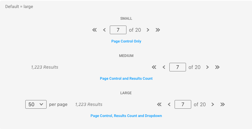
Every list of content should have pagination included. Pagination is a pattern of components that can be used in many different variations depending on the size or complexity of the page.
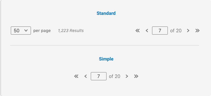
Standard pagination should include all components, including the page controls, the per page dropdown, and the results count.
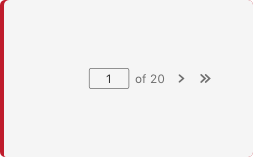
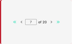
Simple pagination appears in cases where the page size doesn’t allow for the standard large pagination to be displayed. In this case, the simple pagination would still allow the user to control what page they’re on without it taking up too much space on the page.
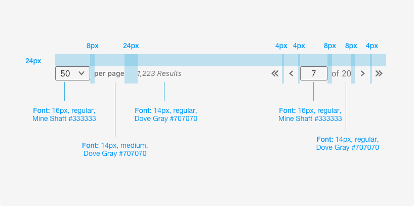
 ## Grammar and Mechanics * Dropdown Labels are lower case * Results Count is title case * No punctuation * When a user clicks into the page input field, the number is automatically highlighted
 Number of Results Per Page
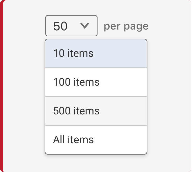
By default, the “per page” dropdown should allow the user to select from 10, 25, 50, and 100 items. To avoid long load times, do not include an “All” option.
However, the number of results in the “per page” dropdown should be determined by the Product Owner with optimal performance in mind.
Placement
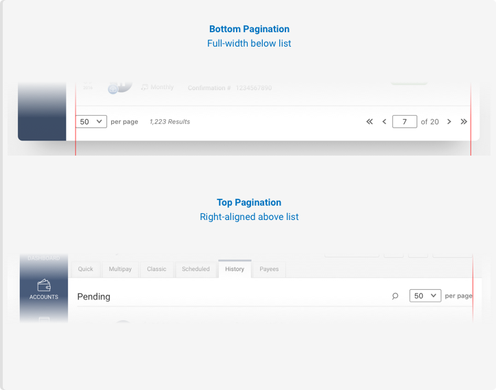
By default, pagination components are at the bottom of the list of content on each page with zero padding to the left and right within the content area.
If the content can all fit on one page then the pagination components should not appear.
Do's and Don'ts
Spacing, Color and Typography
Patterns
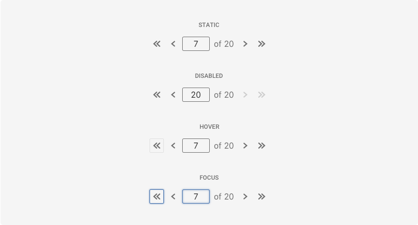
States
Examples
For details on when to use this component, see the Usage tab.
Variants
The variants of this component are as follows:
Simple
<nav class="iris-pagination" aria-label="Page navigation"></nav>

<!-- And initialize the pagination component -->
<script>
  var options = {
    itemArray: ['a', 'b', 'c', 'd', 'e', 'f', 'g', 'h', 'i', 'j', 'k', 'l', 'm', 'n', 'o', 'p', 'q', 'r', 's', 't', 'u', 'v', 'w', 'x', 'y', 'z'],
    size: 2
  };

  var paginationElement = document.getElementsByClassName('iris_pagination')[0];
  Alkami.Iris.PaginationComponent.init(paginationElement, options);
</script>
Standard
Below is an example of using the pagination component in the standard design pattern. We have a div wrapper container with the result set in a dropdown on the left and the pagination component initialized on the right.
<div class="example">
  <div class="example-dropdown-container">
    <div class="iris-dropdown iris-pagination__dropdown" data-size="small" name="dropdown" placeholder="Select number of items per page" aria-label="Select number of items per page" >
      <ul class="iris-options-list">
        <li class="iris-option" data-value="10" aria-label="10 items per page" selected>
            <div class="text--nowrap">10 items</div>
            <div class="iris-option__selected-view">10</div>
        </li>
        <li class="iris-option" data-value="25" aria-label="25 items per page">
            <div class="text--nowrap">25 items</div>
            <div class="iris-option__selected-view">25</div>
        </li>
        <li class="iris-option" data-value="50" aria-label="50 items per page">
            <div class="text--nowrap">50 items</div>
            <div class="iris-option__selected-view">50</div>
        </li>
        <li class="iris-option" data-value="100" aria-label="100 items per page">
            <div class="text--nowrap">100 items</div>
            <div class="iris-option__selected-view">100</div>
        </li>
      </ul>
    </div>
    <span class="example-dropdown-label-right">
      per page <i>1,223 Results</i>
    </span>
  </div>
  <nav class="iris-pagination" aria-label="Page navigation"></nav>
</div>

<!-- And initialize the pagination component -->
<script>
  var options = {
    itemArray: ['a', 'b', 'c', 'd', 'e', 'f', 'g', 'h', 'i', 'j', 'k', 'l', 'm', 'n', 'o', 'p', 'q', 'r', 's', 't', 'u', 'v', 'w', 'x', 'y', 'z'],
    size: 3,
    initPage: 5
  };

  var paginationElement = document.getElementsByClassName('iris_pagination')[0];
  Alkami.Iris.PaginationComponent.init(paginationElement, options);
</script>
Accessibility
As always, we want all of the components in the application to be accessible. Please keep the following notes in mind while using this component:
- If the UI changes when a user paginates and the new content is meant to be focused on (e.g. rendering the next 50 items), make sure to manually focus the content area using the
element.focus()method.
Additionally, these are some things that we have taken care of for you:
- All of the pagination buttons have a role of
aria-labeladded to it with the appropriate pagination messages, respectively. - All pagination controls are actionable using the space and enter keys.
API
Examples
Initializing the Pagination Component and subscribing to it's change event
var options = {
  itemArray: ['a', 'b', 'c', 'd', 'e', 'f', 'g', 'h', 'i', 'j', 'k', 'l', 'm', 'n', 'o', 'p', 'q', 'r', 's', 't', 'u', 'v', 'w', 'x', 'y', 'z'],
  size: 2,
  initPage: 3
};

var paginationElement = document.getElementById('test_iris_pagination');
Alkami.Iris.PaginationComponent.init(paginationElement, options);

paginationElement.addEventListener('iris.pagination.change', function(e) {
  console.log('---- Pagination Change ----');

  // The event detail object contains additional information about the pagination component
  const currentPage = e.detail.currentPage; // current page displayed in pagination input
  const items = e.detail.items; // current chunk of the array
})
Options
Name | Type | Description | Required -------------- | -------------------------------------------------------------- | ----------------------- itemArray | array | The array name used to paginate over. | yes size | number | The size of the pagination dataset. Ex. 25 results per page | yes initPage | number | The page to initialize the pagination on. | no
Events
| Name | Description |
|---|---|
| iris.pagination.change | Fires after the any change event occurs on the pagination component. Ex. Clicking or pressing enter on the next button. |
Methods
static PaginationComponent.init(element, options?)
Initializes any new Pagination Component found if node is not passed in, otherwise initializes only on the node. Returns an array of PaginationComponent.
static PaginationComponent.destroy(node)
Destroys the PaginationComponent view model associated with the node.
Properties
static PaginationComponent.items
- array
Gets/Sets the itemArray.
static PaginationComponent.paginationSize
- number
Set the size of the pagination dataset.
static PaginationComponent.currentPageIndex
- number
Gets/Sets the curent page index.
Variables
The variables used in this component are as follows:
// Color variables
$pagination-background-direction-button-hover: $wild-sand;
$pagination-background-direction-button: transparent;
$pagination-border-direction-button-hover: $dove-gray;
$pagination-border-direction-button: transparent;
$pagination-text-direction-button-hover: $dove-gray;
$pagination-text-direction-button: $dove-gray;
$pagination-focus-color: $steel-blue;
$pagination-text-total-color: $dove-gray;
Themeability
Nothing is themeable in this component.