Tab
General Guidelines
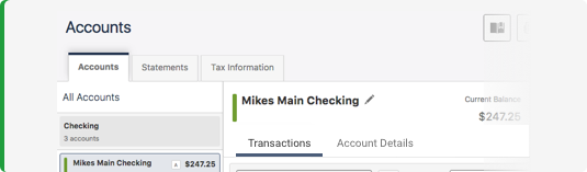
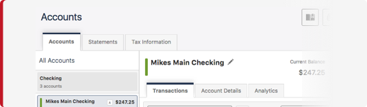
A tab is used as part of a navigation system at the top of a set of containers. Each tab keeps related content in a single container that is shown and hidden through the navigation when the user clicks on the associated tab.
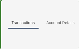
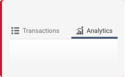
The tab that is currently displaying content should be indicated by a tab highlight and darker text, while the inactive tabs should be grayed out and use regular text.
Primary tabs are best used on the Desktop platform. For Mobile interfaces, the sub-task styling works best.
Voice and Tone
Be concise. Use one or two short words for tabs. Make the intent of the tab clear by using a brief description of what can be found in the tab once it is selected (for example: Settings).
Grammar and Mechanics
- Limit the total character count to fifteen, because the tab width is dynamic to the character length of the tab labels. Therefore, the tab will grow with the character count, and you want to avoid varying the size of tabs in order to keep a consistent look and feel.
- Use title case for Tabs
Usage
| Configurations | When |
|---|---|
| Use tabs | For the Desktop platform. |
| Use sub-tabs | For Mobile interfaces and when there is already a primary tab structure. |
| Use a single, primary tab structure | To simplify navigation. |
| Tab limitation | As a design best practice and to be cognizant of the limits of the size of the screen area, limit tabs to 5 or less. |
Do's and Don'ts
Size and Padding
Tabs style options include Primary, Sub, and Alternate. The Sub tab style can be used instead of the Primary tab style. The Alternate tab style is used at the UX designers discretion and will be identified in the design.

Hover
The default Primary hover animation includes a color bar that grows to 50% of the themed color and the background fills to white. The default Secondary hover animation includes a color bar that grows to 50% of the themed color. The Alternate hover includes bold text, and a background of white, hex value FFFFFF, at 50% opacity.

Scrollable Tabs
If there is a need to have scrollable tabs, the beginning and end tabs (not including the first tab) fade to zero opacity starting at 8 pixels and includes a chevron button. This gives the user a visual queue that there are additional tabs available. A user can scroll by swiping the tabs or clicking on the chevron button.

Examples
For details on when to use this component, see the Usage tab.
Variants
The variants of this component are as follows:
Main
<nav class="iris-tabs iris-tabs--main" aria-label="Widget navigation">
    <div class="iris-tabs__inner">
        <ul class="iris-tabs__list" >
            <li class="iris-tabs__list-item" >
                <a class="iris-tabs__link" href="#">Accounts</a>
            </li>
            <li class="iris-tabs__list-item" aria-selected="true">
                <a class="iris-tabs__link" href="#">Statements</a>
            </li>
            <li class="iris-tabs__list-item" >
                <a class="iris-tabs__link" href="#">Tax Information</a>
            </li>
        </ul>
    </div>
</nav>
Sub
<nav class="iris-tabs iris-tabs--sub" aria-label="Page navigation">
    <div class="iris-tabs__inner">
        <ul class="iris-tabs__list" >
            <li class="iris-tabs__list-item" >
                <a class="iris-tabs__link" href="#">Accounts</a>
            </li>
            <li class="iris-tabs__list-item" aria-selected="true">
                <a class="iris-tabs__link" href="#">Statements</a>
            </li>
            <li class="iris-tabs__list-item" >
                <a class="iris-tabs__link" href="#">Tax Information</a>
            </li>
        </ul>
    </div>
</nav>
Icons
<nav class="iris-tabs iris-tabs--sub" aria-label="Page navigation">
    <div class="iris-tabs__inner">
        <ul class="iris-tabs__list">
            <li class="iris-tabs__list-item">
                <a class="iris-tabs__link" href="#">
                    <span class="iris-tabs__link-icon font-icon-house"></span>
                    <span class="iris-tabs__link-text">Accounts</span>
                </a>
            </li>
            <li class="iris-tabs__list-item" aria-selected="true">
                <a class="iris-tabs__link" href="#">
                    <span class="iris-tabs__link-icon font-icon-memo"></span>
                    <span class="iris-tabs__link-text">Statements</span>
                </a>
            </li>
            <li class="iris-tabs__list-item">
                <a class="iris-tabs__link" href="#">
                    <span class="iris-tabs__link-icon font-icon-fi"></span>
                    <span class="iris-tabs__link-text">Tax Information</span>
                </a>
            </li>
        </ul>
    </div>
</nav>
Accessibility
As always, we want all of the components in the application to be accessible. Please keep the following notes in mind while using this component:
- Make sure that there is an
aria-labelonnav.iris-tabsthat is set to the name of the tabs - You must have an id attribute on the tab and a corresponding aria-labelledby attribute on the panel itself to associate the two together
- You must have an aria-controls attribute on the tab and a matching id on the panel to associate the two together
- When a tab is selectedthe aria-hidden attribute on the panel must be updated
- Each panel needs to have a role of "tabpanel" to ensure the user gets notified when a change occurs in the panel
Additionally, these are some things that we have taken care of for you:
- All of the tabs have a role of
tabadded to it - All of the tabs have a
tabindex=0 - The tab list has a role of
tablistadded to it - Since screen readers do not require the navigation buttons to navigate a long tab list, we put a
aria-hidden="true"on them - When a tab is selected, the aria-selected attribute on the tab will be updated.
API
Options
| Name | Description | Default |
|---|---|---|
| leftIconClass | The class name used for the Left Button if tabs are too long. | 'fa fa-chevron-left' |
| rightIconClass | The class name used for the Right Button if tabs are too long. | 'fa fa-chevron-right' |
EventListener
| Name | Description |
|---|---|
| activate | Fires when a tab is selected. |
| navPressed | Fires when the left or right navigation buttons are pressed. |
Constructors
new TabListComponent(element)
element- The.iris-tabselement.
Create a new TabListComponent using the element. The constructor expects the TabListComponent markup to be available in the specified element.
new TabComponent(tabElement, tabListElement)
tabElement- The.iris-tabs__list-itemor list item element .tabListElement- The.iris-tabs__listor list element.
Create a new TabComponent using the element.
Methods
static TabListComponent.init([nodeOrNodeList])
nodeOrNodeList- The optional node or node list that will be configured to be tags. Default: the query.iris-tabsis used.
initializes Tabs that appear in the markup.
static TabListComponent.componentForElement(element)
element- The element that may be a Dropdown
Checks if a DOM element has a TabListComponent object associated with it. Returns the TabListComponent object if one exists or null if one is not found.
static TabComponent.createTabElement(textOrHtmlElement [, link])
textOrHtmlElement- text or rich media HTML that represents the Tab Title.link- optional href to link the tab to.
Helper Function that returns an LI element to help build tabs that can be inserted into the the TabListComponent;
Properties
tablist.activeTab
- TabComponent
Gets the currently selected Tab. read only
tablist.element
- HTMLElement
Gets the element that represents the TabListComponent. read only
tablist.tabs
- TabComponent[]
Gets the tabs. read only
tab.element
- HTMLElement
Gets the element that represents the TabComponent. read only
tab.active
- boolean
Gets/Sets the tab's selected state.
Variables
The variables used in this component are as follows:
// Transition variables
$tabs-hover-transition-length: 0.25s !default;
$tabs-scrollable-transition-length: 0.5s !default;

// Dimension variables
$tabs-scrollable-overlay-width: 105px !default;

// Padding variables
$tabs-nav-button-padding: 10px 8px !default;

// Text variables
$tabs-nav-button-font-size: 1.1rem !default;
$tabs-nav-button-color: $dove-gray !default;

// Background variables
$tabs-nav-button-hover-background: $alto !default;
Themeability
Tabs are extremely themeable. The main thing that you will be themeing is the tab types and the active colors, this can be done using the _tabs.scss theme overides file. The variables accessible in that file are as follows:
// Tab type variables
$main-tab-type: 'Overline' !default;
$sub-tab-type: 'Underline' !default;

// Padding variables
$tabs-padding-main: 10px 15px !default;
$tabs-padding-main-active: 10px 15px !default;
$tabs-padding-sub: 10px 15px !default;
$tabs-padding-sub-active: 10px 15px !default;

// Text variables
$tabs-font-size-main: 1.3rem !default;
$tabs-text-color-main: $dove-gray !default;
$tabs-font-size-sub: 1.3rem !default;
$tabs-text-color-sub: $dove-gray !default;

// Background variables
$tabs-background-main: $wild-sand !default;
$tabs-background-main-hover: transparentize($white, 0.5) !default;
$tabs-background-main-active: $white !default;
$tabs-background-sub: $wild-sand !default;
$tabs-background-sub-hover: transparentize($white, 0.5) !default;
$tabs-background-sub-active: $white !default;

// Border variables
$tabs-border-color-main: $alto;
$tabs-border-color-sub: $alto;

// Misc variables
$tab-active-border-color-main: $primary-color !default;
$tab-active-text-color-main: $primary-color !default;
$tab-active-border-color-sub: $primary-color !default;
$tab-active-text-color-sub: $primary-color !default;
Variant: *Main** | State: None | Decorator: None*
<nav class="iris-tabs iris-tabs--main" aria-label="some tabs">
    <div class="iris-tabs__inner">
        <ul class="iris-tabs__list" role="tablist">
            <li class="iris-tabs__list-item" role="tab">
                <a class="iris-tabs__link" href="#">Accounts</a>
            </li>
            <li class="iris-tabs__list-item ">
                <a class="iris-tabs__link active" href="#">Statements</a>
            </li>
            <li class="iris-tabs__list-item" role="tab">
                <a class="iris-tabs__link" href="#">Tax Information</a>
            </li>
        </ul>
    </div>
</nav>
Variant: *Sub** | State: None | Decorator: None*
<nav class="iris-tabs iris-tabs--sub" aria-label="some tabs">
    <div class="iris-tabs__inner">
        <ul class="iris-tabs__list" role="tablist">
            <li class="iris-tabs__list-item" role="tab">
                <a class="iris-tabs__link" href="#">Accounts</a>
            </li>
            <li class="iris-tabs__list-item ">
                <a class="iris-tabs__link active" href="#">Statements</a>
            </li>
            <li class="iris-tabs__list-item" role="tab">
                <a class="iris-tabs__link" href="#">Tax Information</a>
            </li>
        </ul>
    </div>
</nav>