Empty State
A component used to inform users of a lack of data in a specific context.
General Guidelines
The empty state component appears when a list, table, or chart has no items or data to show to a user. The empty is is shown to provide explanation and prevent confusion for the user.
Placement
An empty state component appears in the area where content usually appears.
Voice and Tone
The empty state message should be:
- Message should be concise, simple, clear and scannable
- Be conversational
- Message should be action-oriented
- Include only one primary call to action
Grammar and Mechanics
- The header should be title case
- Description sentence case
Usage
| Configurations | When |
|---|---|
| Use an empty state | When no content or data is available. |
| Use an empty state | To prevent confusion on the part of the user in why they are not seeing any data or results. |
Do's and Don'ts

Do provide an auction-oriented message or explanation for the user
Do provide only one primary call to action

Don’t use misleading titles and calls to actions
A component used to inform users of a lack of data in a specific context.
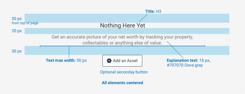
Spacing, size, padding, and typography

A component used to inform users of a lack of data in a specific context.
Examples
For details on when to use this component, please see the Usage tab.
No Assets
Get an accurate picture of your net worth by tracking your property, collectables or anything else of value.
<div class="iris-empty-state">
    <div class="iris-empty-state__inner">
        <h3 class="iris-empty-state__title">No Assets</h3>
        <p class="iris-empty-state__copy">Get an accurate picture of your net worth by tracking your property, collectables or anything else of value.</p>
        <div class="iris-empty-state__actions">
            <button class="iris-button iris-button--secondary">
                <span class="iris-button__icon font-icon-add" aria-hidden="true"></span>
                <span class="iris-button__text">Add an Asset</span>
            </button>
        </div>
    </div>
</div>
Accessibility
As always, we want all of the components in the application to be accessible. Please keep the following notes in mind while using this component:
- Use correct text elements
- Follow accessibility guidelines for nested components
Variables
The variables used in this component are as follows:
// Font variables
$empty-state-title-color: $mine-shaft !default;
$empty-state-copy-color: $dove-gray !default;
Themeability
Nothing is themeable in this component.
